
Exploratory data analysis or EDA is the initial investigation performed on the dataset to get the insights of data, to detect the patterns, and to test the hypothesis with the help of statistics and visual methods.
Exploratory data analysis provides you an overview of the data. One can use different statistical and graphical techniques to get familiar with the data and to determine the important features which can help to classify the data points more efficiently.
Example on EDA
Let’s take an example, suppose you love traveling and you have explored all parts of India except North-East India and now you want to explore North-East India. The first thing you will do is you will search for the best touring agency, facilities provided by the touring agency, important destinations to visit, reviews of the touring agency, best time to visit the places, things to carry for the trip and of course your budget for the trip, etc.
Being a frequent traveler you know that spending some time on preplanning will save your time on the actual trip and also save some bucks. You will get to know about the history of each state and tourist places. This will definitely make your traveling experience soothing. This is refer exploratory data analysis in data scientist language.
In this article, we will discuss the different techniques of EDA on Haberman’s survival dataset.
You can download the dataset from here
Haberman’s Survival Dataset
The dataset contains cases from a study that was conducted between 1958 and 1970 at the University of Chicago’s Billings Hospital on the survival of patients who had undergone surgery for breast cancer. The dataset contains the age, operation_year, axillary_nodes, and survival_status of each patient.
Now, let’s import some libraries and dataset and start EDA to get some insights of the data.
Here we are importing pandas, NumPy, matplotlib, and seaborn libraries. The CSV file doesn’t contain the column names so mention the column name for each column.

Output –

In Haberman’s survival dataset age, operation_year, axillary_positive_nodes are the input/independent variable and survival_status is the output/dependent variable. survival_status has only two values and that is 1 and 2. Where 1 stands for a patient who has survived for more than 5 years after the operation and 2 stands for the patient who has survived for less than 5 years after the operation.
Now let’s check for the total number of rows and columns in the dataset and also check if the dataset is balanced or not?

Output –

Just for a better understanding, I have replaced the 1 and 2 values of the suvival_status column to “more_than_5” and “less_than_5” resp.
Observations:
- There are a total of 306 rows and 4 columns in Haberman’s dataset. So the dataset size is pretty small.
- 225 patients out of 306 from the database survived for more than 5 years after the operation.
- 81 patients out of 306 from the database survived for less than 5 years after the operation.
- Number of patients who have survived for more than 5 years is approx 3 times than the number of patients who have survived for less than 5 years. Hence the dataset is unbalanced. So here one can use the upsampling or downsampling technique to balance the dataset.

Describe() function gives the std dev, mean, min, max, and quantiles values of each numerical variable.
Here there are only 3 attributes that can decide the survival_status of the patient. So, to analyze we can plot the 3D plot but the 3D plot is somewhat difficult for analysis as it requires more mouse movement. So, to analyze the data we are creating a 2D pair plots.


Observations:
1. age and axillary_positive_nodes graph can somewhat distinguish the survival_status as compared to other plots.
2. Age and axillary_positive_nodes may be the important attributes to classify the survival_status.
Now let’s plot the histogram and probability density function for each attribute to know its importance in classifying the survival_status.
Histogram and PDF of axillary_positive_nodes:


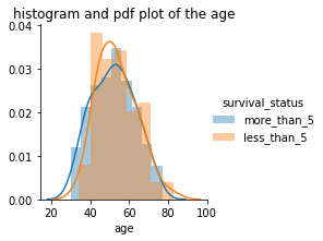
PDF of age & its Histogram:

Histogram and PDF of operation_year:


Observations:
- if the axillary_positive_nodes are less than 3 then there is more probability that the patient will survive more than 5 years.
- age and operation_year plots are overlapping for survival_status so can’t conclude anything.
From this, we can conclude that the axillary_positive_nodes attribute is the most important attribute for the classification of the survival_status.
Box and whisker plot:
Boxplot is the graphical method that shows the numerical data through the Quantiles range. Lines extending from the box are called whiskers. The Boxplot shows how the numerical values are spread or distributed over the Quantiles.
The boxplot shows the minimum, Q1 (25%), Q2 (50%), Q3 (75%), and maximum values for the numerical variable. It also tells you about the outliers, if any data point is significantly away from the minimum or maximum value of the boxplot then that point can be treated as an outlier.
Boxplot of axillary_positive_nodes


Observations:
- approx 75% of patients who survived more than 5 years after operation were having auxillary_positive _nodes <=3.
- approx 50% of patients who survived less than 5 years after operation were having axillary_positive_nodes >3.
Violin Plot:
Violin plot is the method to plot the numerical data. however, Violin plots are similar to the boxplot with the addition of the probability density function.
they are more informative than the boxplot. Boxplot only shows the Quantiles, minimum and maximum values of the numerical data but violin plots give the total distribution of the numerical data.
Violin plot of axillary_positive_nodes:


Observations:
- Most of the patients who survived for more than 5 years after the operation were having less than 10 axillary_positive_nodes.
- There is a widespread of axillary_positive_nodes for survival status “less_than_5” as compared to survival_status “more_than_5”.
PDF and CDF graph of survival_status based on axillary_positive_nodes:

Observations:
- More than 80% of patients who have survived for more than 5 years were having axillary_positive_nodes<=3.
Contour Plots:
Contour plots are the 3 Dimensional surfaces on a 2 Dimensional plane. It is mostly used in the topological survey to determine the elevation of the sites. The innermost contour has the highest density or elevation.
Age and axillary_positive_nodes attributes are important attributes to predict the survival_status as compared to operation_year. So, here we are using age and axillary_positive_nodes attributes for plotting the contour plot.


Observations:
- The contour plot has very less spread for those who survived for more than 5 years. This means those who had 1 or 2 axillary_positive_nodes survived for more than 5 years after the operation.
- contour plot for less than 5 years survival status has big spread as compared to its counterpart. This means patients who had more than 1 or 2 auxillary_positive_plot are less likely to survive for more than 5 years.
Conclusion:
In this article, we performed the EDA on the Haberman’s survival dataset and found out the most important attributes for the classification of the survival status and also discovered some insights from the dataset. We also studied the different techniques used to perform exploratory data analysis on the data.
written by: Sanket Landge
reviewed by: Rushikesh Lavate
If you are Interested In Machine Learning You Can Check Machine Learning Internship Program
Also Check Other Technical And Non Technical Internship Programs