Data Visualization Using Seaborn And Types Of Plots In Seaborn.

Data Visualization Using Seaborn And Types Of Plots In Seaborn.

Seaborn

In today’s world, there is a large amount of data is present in structured and unstructured form and to understand this data by reading is very very difficult the best way to understand this data is to convert it into visualization form to do this seaborn is one of the visualization libraries in Python, which helps to draw statistical graphics with a high-level interface. Seaborn provides a variety of functionality which makes it useful and easier than other frameworks.

Installation of a library :

There are multiple ways to install the seaborn library, let’s see how to install it :


1. Using pip command :

Data Visualization Using Seaborn And Types Of Plots In Seaborn.

2. Using conda command :

Data Visualization Using Seaborn And Types Of Plots In Seaborn.

3. Using Jupyter notebook or Google colab :

If you want to install the Seaborn library directly using Jupyter notebook or Google colab then use following command :

 
Data Visualization Using Seaborn And Types Of Plots In Seaborn.

4. Install Seaborn with required version


You can also install seaborn with required version by using command :

Data Visualization Using Seaborn And Types Of Plots In Seaborn.

Upgrading a library:


To upgrade the installed library we can use a command

Data Visualization Using Seaborn And Types Of Plots In Seaborn.

Importing of a library:


To make use of the functions in a library, you’ll need to import the library with the help of an import statement. An import statement is created by the import keyword along with the name of the library.


Importing seaborn library :

Data Visualization Using Seaborn And Types Of Plots In Seaborn.

We can also import the python library using the alias.

Data Visualization Using Seaborn And Types Of Plots In Seaborn.

here, import the “seaborn” library using the alias “sns”.

Instead of the whole library, if you want to import a specific function in it you can also do this by using from – import method.

suppose you want to import scatterplot function in the seaborn library using alias scatter you can follow the below command :

Data Visualization Using Seaborn And Types Of Plots In Seaborn.

Visualization using Seaborn

Visualization is a representation of data or information by using charts,

graphs and maps. It provides an easy way to understand patterns, outliers and trends hidden in the data which cannot be understood by simply looking at the data tables.

Type of charts/graphs/plots :

  • Line plot

  • Countplot

  • Bar chart

  • Pairplot

  • Scatter plot

  • Histogram

Line Plot

A line plot is the simplest plot in all plotting types, as it is the visualization of a single function. This plot helps us to see the relationship between X-axis, Y-axis and it also takes some parameters such as hue, size, color, etc.  


Code :

Data Visualization Using Seaborn And Types Of Plots In Seaborn.

Output :

Data Visualization Using Seaborn And Types Of Plots In Seaborn.

Count plot:

A count plot is used to show the counts of observations in each categorical bin using bars.

This method is accepting the parameters X, Y  which take the name of a variable in data, hue it is an optional parameter it helps to take column name for color encoding. Data is also an optional parameter that takes DataFrame, array, or list of arrays, Dataset for plotting.


Code :

Data Visualization Using Seaborn And Types Of Plots In Seaborn.

Output :

Data Visualization Using Seaborn And Types Of Plots In Seaborn.

Bar Plot

A Bar Chart is a way of comparing a set of categorical data. It is better to convert continuous data to bins before plotting. The bar chart displays data

using several bars, each representing a particular category. This method is accepting the parameters X, Y  which take the name of a variable in data, hue it is an optional parameter it helps to take column name for color encoding.

Code :

Data Visualization Using Seaborn And Types Of Plots In Seaborn.

Output :

Data Visualization Using Seaborn And Types Of Plots In Seaborn.

Pair Plot

Pair plot creates a grid of axis such that each numeric variable in data will create a plot between each other the y-axis across a single row and the x-axis across a single column. The diagonal plots are a univariate distribution plot that helps to draw the marginal distribution of the data in each column.

A pair plot pairwise relationships with other columns in the data frame and also plot pair plot with itself.


Code :

Data Visualization Using Seaborn And Types Of Plots In Seaborn.

Output :

Data Visualization Using Seaborn And Types Of Plots In Seaborn.

Scatter Plot

Scatter Plot is the same as a line plot, in a line plot instead of points being joined by line segments, the points are shown individually with a dot, circle, or any other shape. The position of each marker on the horizontal and vertical axis indicates values for an individual data point. This plot is used to observe relationships between variables.

This method is accepting the parameters X, Y  which take the name of a variable in data, hue it is an optional parameter it helps to take column name for color encoding. Marker is a parameter that is used to change the shape of the point which is shown in the plot.

Code :

Data Visualization Using Seaborn And Types Of Plots In Seaborn.

Output :

Data Visualization Using Seaborn And Types Of Plots In Seaborn.

Histogram 

A histogram is a graph that shows the underlying frequency distribution of a set of continuous data. This chart is helpful in data collection and data analysis and hence it is widely used in the analytics industry. By plotting it allows to inspect the overall distribution of the data, outlier, skew present in the data.

Code :

Data Visualization Using Seaborn And Types Of Plots In Seaborn.

Output :

Data Visualization Using Seaborn And Types Of Plots In Seaborn.

Parameters of Plot

There are lots of parameters that are available in the seaborn plots which are useful for different types of plots.


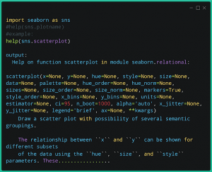
Here is some parameters (x=None, y=None, hue=None, style=None, size=None, data=None, palette=None, hue_order=None, hue_norm=None, sizes=None, size_order=None, size_norm=None, markers=True, style_order=None, x_bins=None, y_bins=None, units=None, estimator=None, ci=95, n_boot=1000, alpha=’auto’, x_jitter=None, y_jitter=None, legend=’brief’, ax=None, **kwargs)


Where,

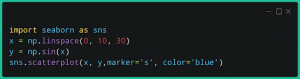
X, Y:  takes the name of a variable in data.

 hue: is an optional parameter it helps to take column name for color encoding.


marker: is used to give shape to point in scatterplot and etc.

data: DataFrame where given columns and rows are present, etc

you can find the required parameter of the given plot by using the     


below command:

Data Visualization Using Seaborn And Types Of Plots In Seaborn.

Article By : Rushikesh Lavate

If you are Interested In Machine Learning You Can Check Machine Learning Internship Program

Also Check Other technical and Non Technical Internship Programs

Facebook
WhatsApp
LinkedIn
Email